How To Design Notebook Interior Pages For Binding And Writing
Leave a message
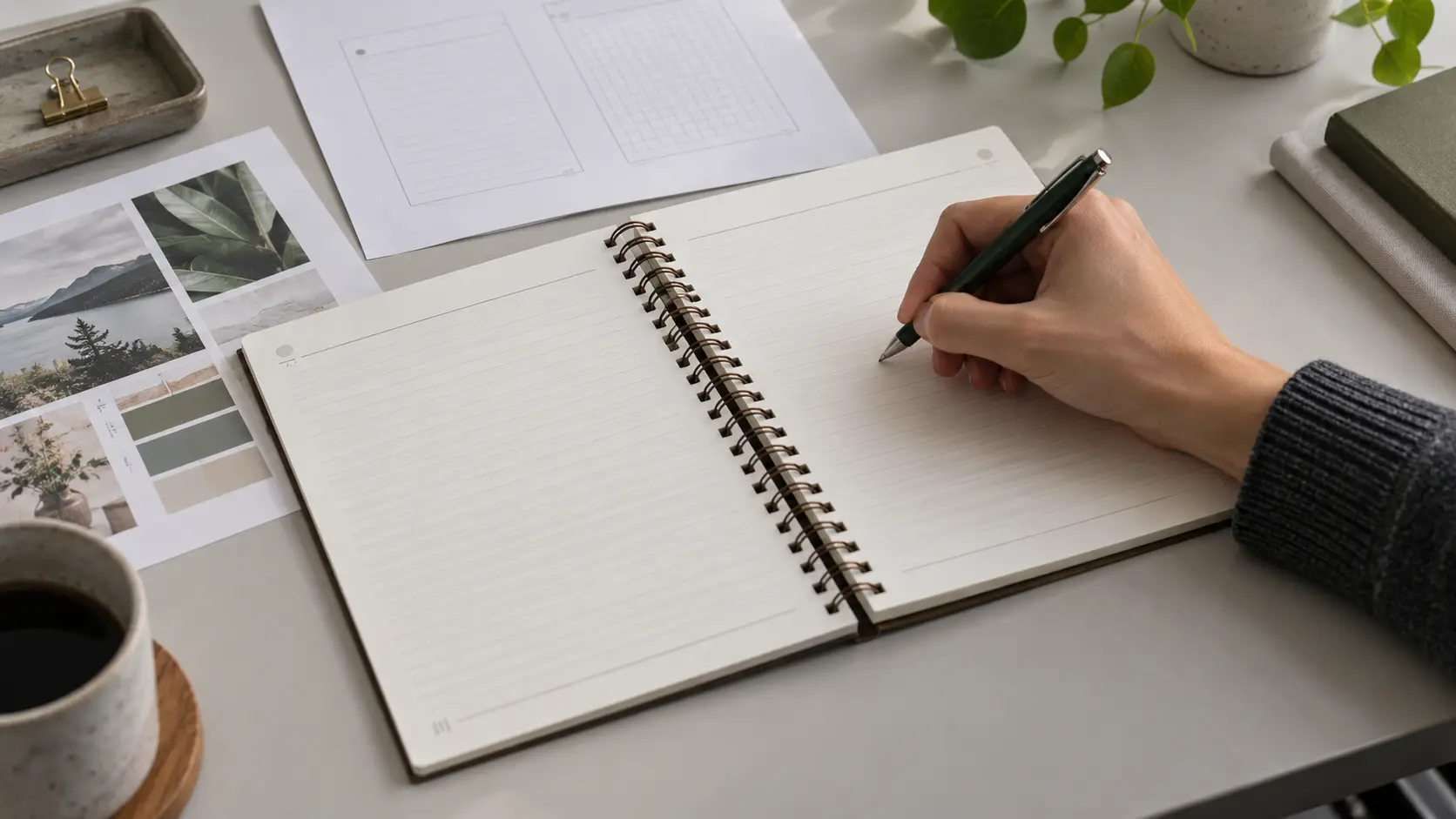
Notebook interior page design is easy to judge on a screen and surprisingly easy to get wrong in a finished book. A line, page number, planner box, illustration, or brand element can look perfectly balanced in a PDF, then end up too close to the holes, visually crowded by the coil, or awkward to write beside once the pages are punched and bound.
The reliable solution is not to copy a universal "spiral binding margin." Build the layout around the actual book: final trim size, binding edge, punch pattern, binding element, page orientation, and physical proof. Then separate the area that must survive punching from the area that should feel comfortable for handwriting.
If you are still deciding the notebook as a whole-paper, cover, binding and interior together-start with YPS's broader notebook material and product-development guide. This article stays focused on the interior layout itself.
Start With the Binding System, Not the Page Decoration
Before you draw a ruling grid or place a logo, define the physical constraints that will exist after printing. At minimum, the interior designer should know:
- the finished trim size and orientation;
- which physical edge will be punched;
- the binding system that will be used;
- the actual punch pattern or production template;
- how front and back pages map to the binding edge;
- whether artwork bleeds to the trim;
- the intended paper and finished book construction; and
- what physical sample will be approved before production.
Those inputs matter because "the margin" is doing several jobs at once. It must keep critical artwork clear of punched holes, prevent important content from feeling trapped behind the binding, and leave enough usable space for a hand, pen, ruler, or other writing tool to work naturally near the spine.
A page that merely survives the punch is not automatically a good notebook page.
Why a Universal Spiral Binding Margin Is a Weak Specification
Search for a spiral binding margin and you will find confident fixed numbers. They can be useful for one printer's workflow, but they should not be treated as a universal engineering rule.
The space required at the binding edge can change with the hole pattern, hole shape, punch setback, pitch, binding element, book thickness, orientation, and the way a particular production line positions the sheet. Even the reference point can differ: one template may measure from the trim edge to the live-text area, while another may describe the distance to the hole line or to the edge of critical artwork.
That means a number copied from another project can fail in three different ways. It may be too small for the actual punch. It may be unnecessarily large and waste valuable writing area. Or it may be measuring a different thing from the value your designer thinks it represents.
Decision rule: use the manufacturer's actual production template or confirmed punch geometry for the project, then verify it on a punched and bound physical sample. Treat generic margin figures as starting references, not release specifications.
Build the Page as Functional Zones
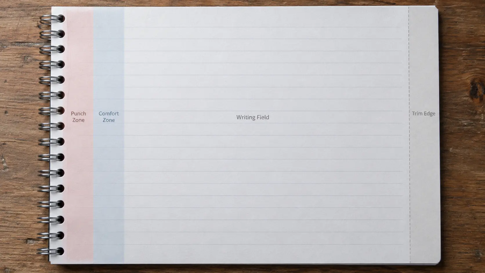
A useful notebook page is easier to design when the canvas is divided by function rather than by one all-purpose margin. The exact dimensions remain project-specific, but the roles are consistent.
| Zone | What It Does | What Belongs There |
|---|---|---|
| Bleed / trim zone | Allows edge-to-edge background or artwork to survive trimming | Background color, noncritical texture, full-bleed imagery where the printer allows it |
| Punch / no-critical-content zone | Protects information from the holes and immediate binding hardware | No essential text, page numbers, logos, box labels, icons, or important illustration detail |
| Binding comfort zone | Creates breathing room between the mechanical spine and active content | Usually quiet space or low-priority decoration that can tolerate visual crowding |
| Active writing field | Defines where the user can write comfortably and repeatedly | Lines, dots, grids, blank writing areas, planner cells, note fields |
| Page furniture zone | Holds recurring navigation and structure | Dates, section labels, page numbers, prompts, trackers, headers and footers |
The important distinction is between the punch-safe zone and the comfortable writing zone. A word can sit outside the holes and still feel uncomfortably close to a thick coil or wire. A planner cell can technically remain intact while becoming unpleasant to fill in because the user's hand rests against the binding.
Set the Binding Edge on Every Physical Page
One of the easiest ways to create an alternating layout error is to think only in digital spreads.
In a duplex notebook, the same sheet has a front and a back. After the sheet is turned in the bound book, the binding edge can appear on the opposite side of the visible page. Software options such as "facing pages," mirrored margins, or single-page layouts can help, but none of them should substitute for understanding how the printer expects the file to map to the finished object.
Mark the binding edge in the production template and check it page by page. This is especially important when:
- left and right pages have different layouts;
- page numbers sit near the inner edge;
- a planner alternates weekly and notes pages;
- tables, calendars, or trackers use full-width boxes;
- decorative borders run around the page; or
- the same artwork will be adapted to portrait, landscape, or top-bound formats.
A fast screen check is to temporarily display the punch band on every page and flip through the file in sequence. The release check, however, should be physical: print, punch, assemble, open the book, and inspect both sides of representative sheets.
Design the Writing Field for a Hand, Not a Screenshot
Once the mechanical boundary is controlled, the next question is not "How much space is left?" It is "How will somebody actually use this space?"
The first usable line or column should not force the writer's hand against the coil. Repeated prompts should be easy to find without dominating the page. Ruling, dots, grids, and printed backgrounds should organize the writing rather than compete with it. A layout that looks richly branded at 100% zoom can become visually exhausting when repeated across dozens of pages.
Different interiors need different priorities:
- Lined pages: check where the rule begins and ends near the binding, whether headings interrupt the writing rhythm, and whether the first useful writing position is comfortable.
- Dot-grid and graph pages: protect the functional grid from the punch zone, but do not force the grid to "match" the hole pattern. They solve different problems.
- Planners and trackers: keep labels, checkboxes, times, and narrow columns away from the mechanical edge. Losing one small label can make an entire repeated template confusing.
- Prompted journals: give the prompt visual authority without shrinking the response area. Test the balance on a printed page, not only on the artboard.
- Illustrated or branded interiors: decide which graphics may safely enter the punch zone and which details must remain intact. Background decoration can tolerate more risk than instructional content.
There is no need to make every page symmetrical. A good interior can deliberately shift the writing field away from the binding or use different page architectures for different sections. What matters is that the decision is intentional and consistent with how the book is held and written in.
Full-Print Interiors Need Two Different Approvals
Full interior printing can carry a brand far beyond a cover logo, but artwork approval and writing approval are not the same event.
The artwork approval asks whether color, registration, typography, illustrations, page sequence, and repeated elements are correct. The writing approval asks whether the printed page still works as a writing surface.
That second check matters because printed areas can change contrast, visual density, and the way handwriting reads against the page. If users will write directly across tinted boxes, diagrams, or colored backgrounds, test those exact areas. Do not test only an untouched white margin and assume the result represents the page people will actually use.
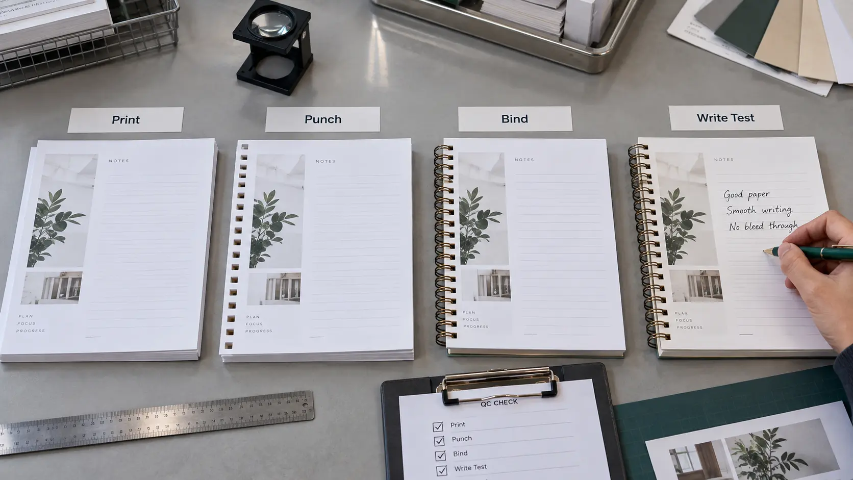
The safest sequence is:
- approve the digital content and page sequence;
- print representative pages on the intended production paper;
- punch those pages with the intended pattern;
- bind them with the intended binding element;
- write in the actual fields with representative writing tools; and
- approve the assembled notebook, not just the loose sheet.
Make the Physical Proof Answer Specific Questions
A proof is most useful when it has release criteria. "Looks good" is too vague for a repeated interior that may appear across an entire production run.
| Check | Pass Question | Typical Failure Signal |
|---|---|---|
| Punch clearance | Do all essential words, icons, rules, borders, and labels remain intact after punching? | Letters, box corners, page numbers, or illustration details intersect the holes |
| Binding comfort | Can the first useful writing position be reached without the binding obstructing the hand? | The user avoids the inner part of the page or rotates the notebook to write |
| Front/back mapping | Does the safe area follow the correct physical edge on both sides of the sheet? | Every second page feels cramped or loses content near the spine |
| Repeated furniture | Are page numbers, prompts, dates, and navigation elements consistently positioned? | Recurring elements drift toward the binding or trim on one page family |
| Writing contrast | Does handwriting remain visually dominant in the areas intended for writing? | Backgrounds, rules, or printed graphics fight with the user's marks |
| Page movement | Do important elements remain easy to see when the notebook is open and pages turn normally? | Content disappears visually behind the binding or feels compressed near the spine |
For a notebook with several page families-monthly planner, weekly spread, notes, trackers, reference pages-include at least one representative of each family in the bound proof. One perfect notes page does not validate a calendar grid with a completely different geometry.
What the Interior Artwork Handoff Should Specify
A production-ready interior brief should remove interpretation from the risky decisions while leaving the manufacturer room to confirm process-specific tolerances.
Include:
- final trim size and orientation;
- page count and page sequence;
- the physical binding edge for each page orientation;
- binding system and the approved punch template or drawing;
- the no-critical-content boundary used in the artwork;
- bleed requirements supplied by the printer;
- which elements may cross into the punch area and which may not;
- the intended paper or approved paper reference;
- the intended binding element used for the finished proof;
- color and file-delivery requirements supplied by the printer;
- a revision number or date for the artwork package; and
- the physical sample that acts as the approval reference.
If the manufacturer changes the punch pattern, binding system, trim size, paper construction, or another input that affects the physical page, the old artwork should not be assumed to remain valid. Recheck the affected geometry.
This is also why a production brief should separate design intent from production values. "Keep the page number comfortably clear of the binding" is design intent. The approved template, measured safe area, and physical sample are the project-specific values that prove how that intent will be produced.
Five Failure Modes That Reveal the Real Problem
1. The page looks centered in the PDF but off-center in the notebook
The layout was centered to the trim rectangle instead of the usable field after binding. Re-evaluate the optical center of the writing area, not just the geometric center of the sheet.
2. A decorative border or table survives trimming but gets broken by holes
The design treated trim safety and punch safety as the same boundary. They are separate. Keep critical linework out of the confirmed punch zone or deliberately design the interruption as part of the visual system.
3. Every second page has the wrong inner spacing
The front/back mapping is wrong. Trace the physical binding edge through the actual duplex page order rather than relying on a document preset that may not match the printer's file workflow.
4. Loose sheets look fine, but the finished notebook is awkward to write in
The proof validated printing but not binding comfort. Punch and bind the sample with the intended binding element before approving the active writing field.
5. One successful template is reused across another notebook size or binding system
A previous template is being treated as universal. Revalidate the trim, binding edge, punch pattern, and physical proof whenever the construction changes.
Approve Geometry First, Then Refine the Aesthetics
The most efficient sequence for notebook interior page design is simple: lock the physical constraints, create the functional page zones, test the writing field, and only then spend time polishing visual details.
That order prevents expensive late-stage compromises. If the punch-safe area changes after the artwork is finished, every border, page number, prompt, tracker, and illustration near the binding may need to move. If the binding geometry is fixed first, the designer can make deliberate aesthetic decisions inside a stable canvas.
For a premium notebook, this does not mean making the interior visually quiet. It means making every decorative decision aware of the object it will become. The binding is part of the page architecture, not an attachment added after design.
If your interior artwork is already developed and you need to move from a digital layout to a physical notebook specification, the YPS premium notebook program is the appropriate next step for project review and sampling. Bring the trim size, page sequence, intended paper, interior artwork, and binding direction so the unresolved production geometry can be identified before bulk manufacturing.