

How To Choose Notebook Cover Finishes: Foil, Emboss, Deboss, Spot UV And Lamination
Leave a message
A notebook cover finish should do more than make a sample look impressive under studio lighting. It should support the artwork, suit the cover substrate, survive the way the product will be handled and still make sense once the cover is punched, bound, opened and carried.
That is why "Which finish looks most premium?" is the wrong starting question. Foil, embossing, debossing, spot UV and lamination solve different design problems. Some add light. Some add relief. Some change the entire surface. Some work best as a restrained accent. The useful decision is to define the role of the finish first, then approve it on the actual cover construction.
This guide is for stationery brands and product teams developing physical notebook samples. It is not a supplier capability list and it does not assume one finish is universally more luxurious than another.
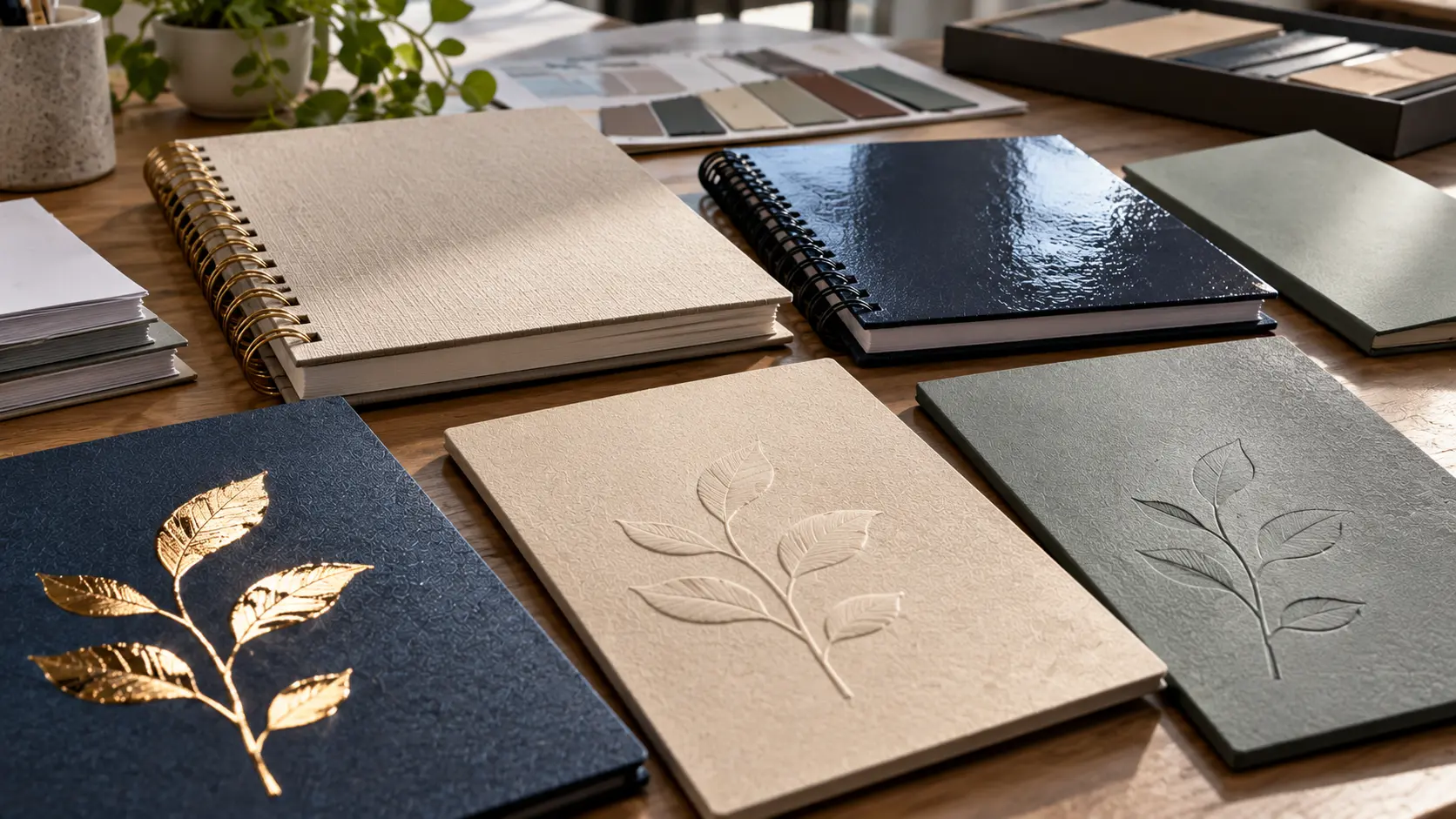
Start With the Job the Finish Needs to Do
Before choosing a process, write one sentence describing what the cover needs from the finish. For example:
- create one bright focal point on a quiet cover;
- make a mark visible mainly through touch and shadow;
- protect a printed surface while controlling gloss;
- add contrast between one graphic element and the surrounding matte field;
- keep branding restrained enough for a daily-carry notebook.
This prevents the common mistake of stacking processes simply because they are available. A finish becomes more useful when it has one clear visual or tactile job.
| Finish | Primary effect | Typical approval question |
|---|---|---|
| Foil stamping | Reflective or colored accent | Does the foil land cleanly and create the intended contrast on this substrate? |
| Emboss | Raised relief | Is the relief readable by touch and light without distorting the cover construction? |
| Deboss | Recessed relief | Does the recessed mark remain clear at normal viewing distance and after handling? |
| Spot UV | Localized gloss or surface contrast | Is the effect visible enough against the base surface, and is registration acceptable? |
| Lamination | Whole-surface appearance and handling change | Does the finished film create the intended gloss, matte or tactile character under real use? |
Choose the Substrate Before You Approve the Decoration
The same artwork does not behave the same way on every cover. Coated paper, laminated printed sheets, fabric, textured stocks, synthetic coverings and other materials can differ in surface energy, texture, compressibility and how sharply they reproduce a decorative effect.
That means a successful foil or deboss sample on one material is not a universal approval for another. The finish should be tested on the intended production substrate, including any lamination or coating that will sit underneath or above it.
When comparing cover directions, record the complete stack rather than only the visible face. A useful description might include the printed sheet or covering material, board or support structure, lamination or coating, decorative finish and binding construction. If one layer changes, identify which surface tests should be repeated.
Use Foil When Light and Contrast Are the Point
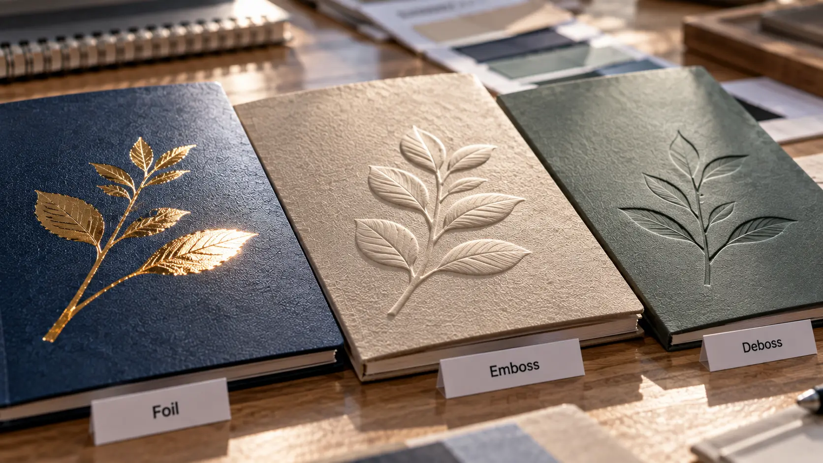
Foil is effective when a small element needs to react to light differently from the rest of the cover. It can create a crisp focal point for a logo, title, line or simple graphic without covering a large area.
The approval questions are physical:
- Is the selected artwork suitable for the actual foil process and substrate?
- Are edges clean at the intended size?
- Does the foil appear continuous rather than broken or incomplete?
- Does the color or metallic effect still work beside the binding hardware?
- Is the finished mark placed away from areas where punching, folding, corner wrapping or other construction steps could interfere?
A metallic reference on a screen cannot show exactly how the physical foil will reflect beside a matte cover, coated wire or plastic spiral. Approve the relationship as a real object.
Foil is not automatically the right answer for large solid areas or highly detailed artwork. The specific process limits depend on the substrate, equipment and tooling, so minimum line widths, areas and tolerances belong in the project specification rather than in a universal blog rule.
Use Emboss or Deboss When Touch Carries the Design
Embossing raises part of the surface; debossing presses it down. Both use relief rather than reflected light as the main design language. They can be especially effective when branding needs to remain quiet or when the material itself should stay visually dominant.
Do not approve relief only from a front-facing photograph. Turn the sample under raking light and feel it with a fingertip. Check whether the mark remains legible when the cover is viewed from normal distance, not only in a macro close-up.
Also inspect the surrounding structure. Relief changes the local surface and can interact with thin coverings, wrapped boards, printing underneath the decoration and any opposite-side impression. The right depth is therefore project-specific. "Deeper" is not automatically "more premium." The goal is a controlled effect that suits the substrate and does not create an unwanted structural or visual disturbance.
Use Spot UV for Local Surface Contrast, Not Just Extra Shine
Spot UV is most useful when the base surface and the selected area need to react differently to light. A glossy spot over a matte field, for example, can make a pattern appear and disappear as the cover moves.
The effect depends on contrast. If both the base and the spot read similarly under normal lighting, the process may add production complexity without adding much information to the design.
On the physical proof, check:
- registration between the printed artwork and the coated area;
- whether the gloss difference is visible under the lighting in which the notebook will actually be seen;
- edge quality around the spot area;
- whether fingerprints, rubbing or handling marks become more obvious than expected;
- whether the effect is still clear after the cover is bound rather than viewed as a flat printed sheet.
For repeating patterns, the question is not only whether every spot is technically present. It is whether the surface rhythm looks intentional across the full cover.
Treat Lamination as a Whole-Surface Decision
Lamination differs from localized embellishments because it changes the character of most or all of the printed cover. Matte, gloss and tactile films can alter reflectivity, perceived color, friction, fingerprint visibility and the way a notebook feels in the hand.
Choose the film with the use environment in mind. A boxed presentation notebook and a daily-carry notebook experience different contact patterns. A surface that feels exceptional when first unwrapped can be a poor choice if the product is expected to live loose in a bag and the finish shows marks quickly.
Do not rely on names such as "matte," "soft-touch" or "scratch-resistant" as complete specifications. Verify the exact construction and approve a physical sample under the handling conditions that matter to the project. YPS's existing cover-release guide goes deeper into the post-selection durability and release checks. This page stays on the earlier decision: choosing and visually approving the finish system itself.
Do Not Combine Finishes Without a Hierarchy
Foil plus emboss, spot gloss over a printed field, or multiple surface treatments can all work. The risk is that each process competes to be the focal point.
Before combining finishes, rank the visual roles:
- What should the viewer notice first?
- What should become visible only when the cover moves or is touched?
- Which element should remain background?
- Does a second process add information, or only add another cost and failure point?
A restrained notebook can feel more deliberate than a cover carrying every premium-process option at once. If the artwork already has strong color, texture and binding hardware, the right finish may be the one that does less.
Keep the Binding Edge in the Cover-Finish Approval
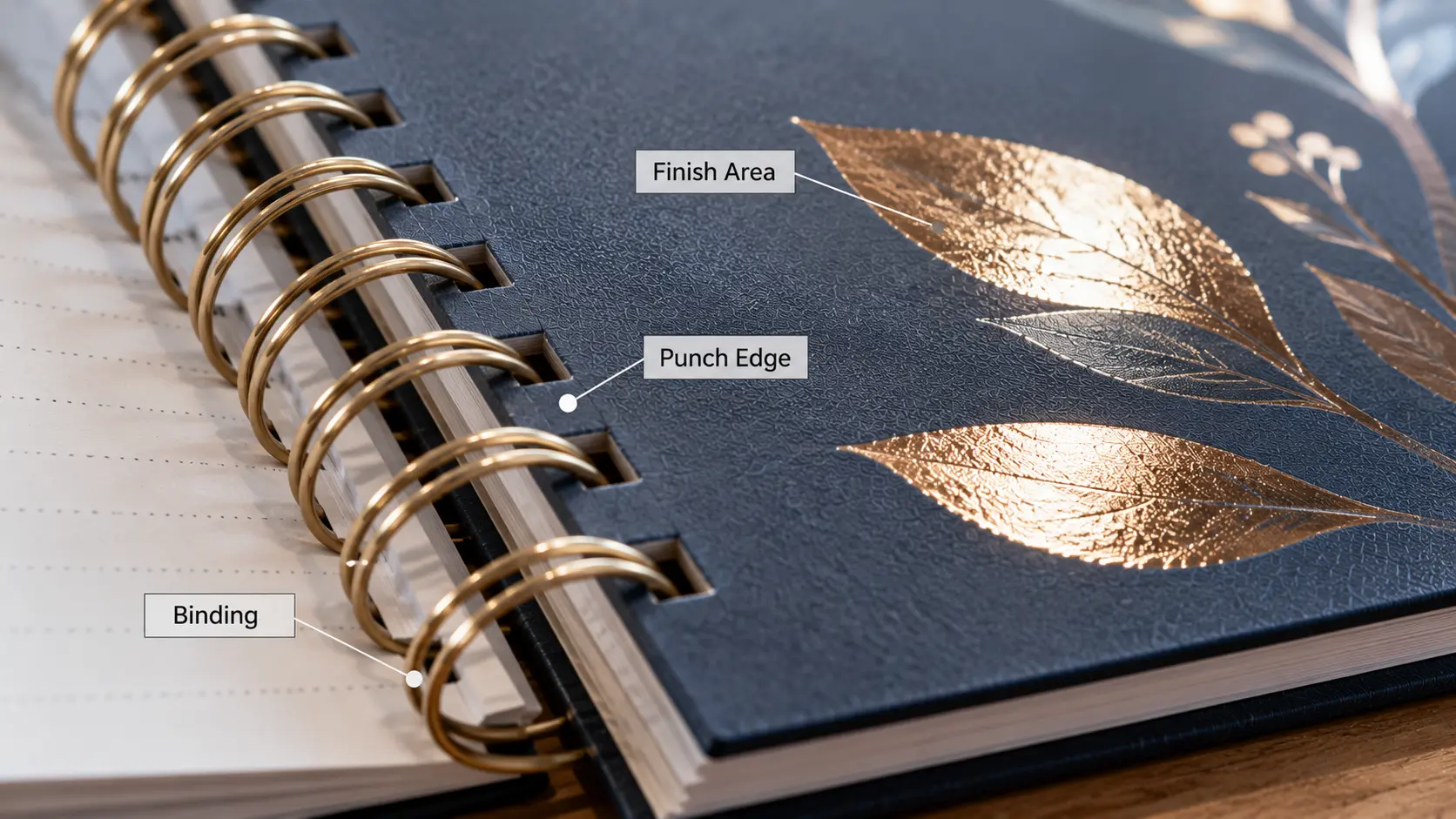
Spiral and Wire-O notebooks expose an interaction that flat print samples hide: the cover moves around a line of punched holes and visible binding hardware.
Review the finish with the cover already converted into the intended notebook construction. Check:
- distance between decoration and the punched edge;
- whether foil, coating or relief is affected by the punch area;
- how the finish looks beside the actual coil or Wire-O color and material;
- whether the decorated surface rubs against binding hardware during normal rotation;
- whether the front and back covers still look balanced when folded fully back, if the construction is meant to do so.
This is a different task from engineering the rigid cover's board, wrap and hole geometry. The finish owner asks whether the chosen decorative surface remains visually and physically appropriate once the engineered cover is bound.
Approve the Finish Under More Than One Viewing Condition
Reflective, tactile and gloss effects change with light and angle. A sample that is judged only under a single bright lamp can create false confidence.
Use a simple repeatable review:
- View the cover face-on under neutral working light.
- Tilt it to reveal foil, relief and gloss behavior.
- Inspect edges and corners.
- Handle the book normally, including opening and fold-back where appropriate.
- Compare front and back construction.
- Place the notebook in the intended package if contact with packaging could mark the finish.
- Record what is approved, including the exact substrate and finish combination.
If durability is a critical product promise, define and document a separate handling or abrasion method instead of relying on phrases such as "scratch-proof." A finish can be appropriate for one use environment and wrong for another without either material being intrinsically poor.

Write a Cover-Finishing Brief a Supplier Can Build
| Brief field | What to define |
|---|---|
| Cover construction | Actual substrate, print layer, board/support and any base coating or film |
| Finish role | Focal highlight, tactile mark, localized gloss, whole-surface protection/feel, or another defined job |
| Artwork | Vector or production artwork, position, intended scale and relationship to other cover elements |
| Binding | Spiral/Wire-O type, visible hardware direction and the finish's relationship to the punched edge |
| Handling scenario | Desk use, boxed gift, retail handling, daily carry or other relevant contact pattern |
| Approval sample | Exact substrate + finish + binding construction to be reviewed physically |
| Acceptance observations | Visual hierarchy, registration, coverage, relief/gloss effect, surface marks and binding-edge interaction |
| Change control | Which material, artwork or process changes require another physical approval |
For current commercial options, the YPS customization page is the appropriate place to confirm what is available for a specific project. Finish availability, substrate compatibility and production limits should be confirmed against the current quotation and sample rather than assumed from a general guide.
A Premium Finish Should Make the Cover More Coherent
Foil, embossing, debossing, spot UV and lamination are not a ladder from basic to luxury. They are different tools.
The better cover is the one in which the finish has a clear role, suits the substrate, works with the artwork and binding, and still produces the intended impression after the notebook is handled as a real object.
That is the approval standard worth carrying into production: not the maximum number of decorative processes, but the minimum set of processes needed to make the cover feel deliberate.


