Custom Notebook Design for Corporate Gifts: Six Details Buyers Notice First
Leave a message
That convergence is the real problem in custom notebook design for corporate gifts, and it is not an aesthetic failure. It is the sum of six production decisions that almost every factory makes by default: how the paper is sized, how cleanly the sheet is cut and punched, what the cover material is made of, how that cover finish behaves after six months of handling, what colour the binding line is, and how long the printed sheets are allowed to dry. Every one of those is a choice. Almost nobody treats them as choices.
We came to notebooks from the machinery side: punching dies, forming machines, wire and filament extrusion. For most of the years since 2017 we were the supplier behind other people's notebooks rather than the name on the cover, because printers and notebook factories buy our coil, our wire and our punching equipment. That is an unusual place to argue from, and it is why this reads as a note about handmade notebook design versus mass produced work rather than a catalogue.
Why Ten "Bespoke" Books End Up Looking Like One
Three defaults do most of the damage.
The first is finish. A production line that runs one lamination film across every job will use that film on your cover too, because changing film means downtime. The second is the binding line. Coil and twin-loop wire ship in black, white and silver because those three colours cover the widest range of orders with the least inventory risk, which is the same inventory logic we walk through in our comparison of Wire-O versus plastic coil binding. The third is interior layout, where a standard ruling plate gets reused across hundreds of SKUs.
None of these is a bad decision for the factory. Each is a rational answer to inventory and changeover cost. But a notebook design brief that accepts all three defaults has already given away most of its differentiation before anyone discusses the logo. The recipient does not consciously register any of it; they simply feel that they have seen this book before, and the gift lands as generic.
Generic is not a soft cost. Industry research into why recipients reject branded items puts poor material or construction first, at over 60%, with designs that feel boring or interchangeable second at 38% (PPAI). Roughly two in five rejections are caused by sameness alone, before anyone evaluates the paper, which makes it a notebook design problem rather than a marketing one.
The useful question for a buyer is therefore not "can you customise the cover." Every supplier says yes to that. The question is which of the three defaults the supplier is actually willing to break, and what it costs them to break it. That answer varies enormously between a trading company and a factory that owns the tooling, and it is the fastest way to tell the two apart.
Where Premium Notebook Design Starts: Ink Behaviour, Not Grammage
Almost every specification sheet in this industry leads with GSM, and almost every buyer has been trained to read a higher number as better paper. It is the wrong test.
What controls whether ink stays on the surface or wicks sideways into the fibre is sizing, the surface treatment applied during papermaking, together with fibre density and any coating. Weight is a proxy for thickness, not for ink handling. Enthusiast testing has made this point repeatedly: very thin Japanese papers in the 50–70gsm range handle wet fountain pen inks with almost no feathering, while ordinary 75–80gsm office paper feathers badly despite sitting inside the "acceptable" weight band, because it was never sized for liquid ink.
Here is the part a spec sheet will not tell you. Sizing and ghosting pull in opposite directions. A well-sized sheet holds ink on top, which means the ink takes longer to dry and stays visible from the reverse. A heavier sheet reduces that show-through but often reads as stiff and papery in the hand, the opposite of the natural, relaxed feel we are trying to build. Every premium notebook design is a negotiation between those two, and where you land should depend on whether the recipient writes on both sides.
If you cannot find that out, and on a gifting programme you usually cannot, assume double-sided use and specify moderate sizing rather than maximum bleed resistance. A sheet optimised purely against bleed-through will dry slowly enough to smear under a left hand, and smearing generates more complaints than faint ghosting ever does. That is the default we apply when a brief arrives without a stated use case.
There is a second, quieter variable that nobody quotes: paper dust. Debris at the punched edge comes from three sources: a punch die past its service life, paper stored at too low a moisture content, and the absence of extraction on the punching station. A book that sheds fibre into the coil channel feels cheap in a way buyers notice immediately and struggle to name. It is also the single easiest defect to hide in a photograph.
What Our Own Pen Test Actually Shows
We write on every paper we quote, and we keep the sheets.


The reason we photograph the reverse side rather than the front is that the front always looks fine. Bleed-through, ghosting and slow-drying smear all show up on the back, and a supplier who only sends you front-side images is telling you something. When you request a pre-production sample, ask for it unbound and unwritten, then write on it yourself with the pen the recipient is most likely to use. For an executive gift programme that is usually a fountain pen or a liquid-ink rollerball, not the ballpoint the factory tested with.
Testing the sample only settles half the question, because the sample and the bulk run are two different objects, and we come back to how that gets controlled further down. Ruling, margins and printed page furniture are decided at the same moment as the paper, and they are the two decisions a notebook design brief most often leaves to the factory by accident. We have set out that side of the work separately in our notes on designing custom pages for branding and gifting programmes.
Covers That Age Well, Not Just Covers That Photograph Well
Cover material is where corporate gift programmes lose the most money, because the failure arrives long after the invoice is closed.
PU-coated covers degrade through hydrolysis: ambient moisture breaks down the polyurethane, the top layer separates from its backing, and the surface flakes. How quickly depends mostly on the resin base, with polyether resisting humidity considerably better than polyester, and on the climate the book ends up in. Heat plus humidity is the worst case. This is common enough across PU goods generally that many manufacturers exclude it from warranty coverage outright, which should tell you how predictable it is. The practical consequence for a quotation is narrow and specific: when a brief names a humid destination, the resin base has to be written into the specification rather than inherited from whatever the cover supplier happened to have in stock. If it is not on the sheet, nobody has decided it, and the decision has been made for you by a purchasing clerk optimising for price.

Soft-touch is the finish most buyers ask for first, and it is also the one that ages worst on the colours they ask for alongside it. It is genuinely pleasant, and it is the single most requested finish in luxury notebook design for brands, but on dark covers (black, navy, oxblood) the high-contact zones polish smooth with handling. The spine corner and the lower right of the front cover go first. The book does not break; it just stops looking new, and it stops looking new fastest on exactly the covers that were chosen to look expensive.
Because this is the one property no photograph can show, we test it rather than describe it. Our bench check runs a coin edge, a key and a folded denim panel across a candidate cover, fifty strokes each under consistent hand pressure, then photographs the panel against an untouched control cut from the same sheet. Dark soft-touch films fail this visibly. Textured cloth and fine-grain materials scatter the marks instead of concentrating them, which is why they read as ageing rather than as damage. We keep the tested panel with the approved sample, so the comparison is still on the shelf when someone asks about it a year into the programme.
Which material is right depends on where the book will live, and the honest answer splits three ways:
| Deployment scenario | Cover risk that dominates | What we specify |
|---|---|---|
| Desk-bound executive gift, temperate office | Finish polishing at contact points | Textured cloth or fine-grain material over soft-touch film; deboss rather than foil on high-wear zones |
| Export to humid or tropical markets (SE Asia, Gulf, coastal LATAM) | PU hydrolysis and delamination | Polyether-based PU at a high hydrolysis grade, or drop PU entirely for cloth, cork or coated board |
| High-volume event distribution, carried in bags | Corner crush and edge abrasion | Heavier board, rounded corners, matte film over soft-touch; accept a plainer surface for a longer life |
Those three rows assume ordinary use: a book opened daily and carried occasionally. Field programmes break the pattern. A notebook that lives in a site vehicle or a trade-show crate is exposed to thermal cycling and grit rather than to hands, and under that load the ranking inverts, with the plainer coated board outlasting materials that score better on a desk. This is the part of notebook design for gifting programmes that a mood board cannot settle, because the specification has to follow the environment rather than the price tier.
Once the material is settled, the remaining decisions are paperwork, and we have set those out field by field in the six specification fields that decide a branded notebook.
The Binding Line Is a Notebook Design Decision, Not a Fastener
The industry consensus is that coil binding reads as a practical tool while case binding reads as a luxury object, and that handing a spiral notebook to a significant client damages perceived value. We disagree, and we will say why plainly rather than calling it a matter of taste.
The consensus is describing default coil, not coil. It is true that a thin, soft, black wire on a stapled-feeling book looks like a student pad. It does not follow that the binding method is the problem. Coil diameter, material, pitch, crimp quality and colour are all independent variables, and the last of those is the one nobody uses.
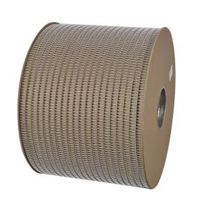
We came out of coil manufacturing, so we hold our own colour inventory and can extrude filament to match a cover palette rather than picking from three stock options. A deep bottle-green coil against a matching cloth cover is not a spiral notebook in the way the consensus means it. It reads as a designed object, because the binding line has been treated as a line in the design rather than as hardware bolted through it.
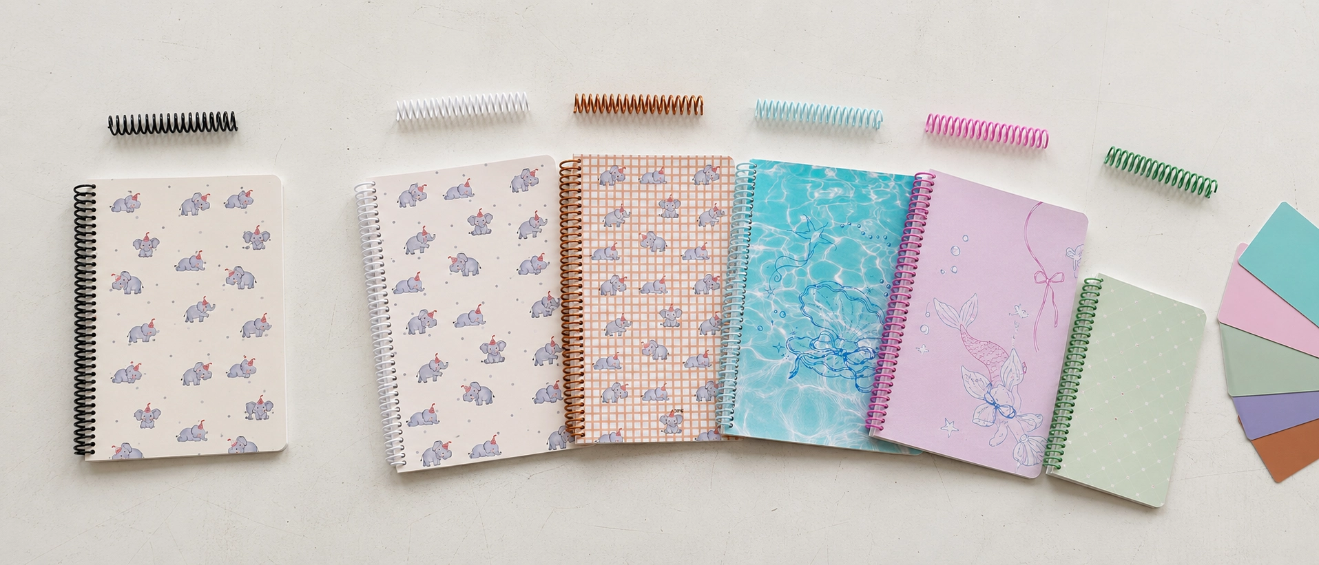
This is also the one notebook design option with a separate production run behind it, so it is worth understanding how it prices before the artwork is approved rather than after. A custom extruded colour is not a finish selection; it is a filament run, which means it carries its own minimum quantity and adds days to the schedule, and both of those move with coil diameter and with how far the target colour sits from a base pigment. The specific figures matter less than getting them into the quotation. A supplier who cannot state the minimum and the added lead time in writing has not costed the run, and an uncosted run does not disappear; it reappears later as a schedule slip or a substituted colour. We also match against a physical chip rather than a screen value, because extruded PVC and a laminated board take pigment differently and a shared Pantone reference is no guarantee that the two will look related in daylight. Below the minimum, the honest answer is to take the closest stock colour and move the budget into the cover.
Coil solves a practical problem that case binding does not: the book opens a full 360 degrees and stays open without a hand on the spine, which matters for anyone who actually writes rather than displays. Our walkthrough of how a custom notebook goes from concept to finished book shows where in the sequence the coil colour has to be locked, because it is earlier than most buyers expect.
What Slow Production Actually Buys You
Long lead times get read as weak capacity. In this category they are usually the opposite.
Plant-based inks dry more slowly than petroleum-based ones. That is their known trade-off, accepted in exchange for a far lower solvent load (soy formulations run around 0.8% volatile organic compounds against roughly 4.6% for petroleum inks) and for cleaner de-inking when the paper is eventually recycled. Print quality itself is not the differentiator; comparative testing has found vegetable-oil and mineral-oil inks perform similarly on press, which is why the choice comes down to health, environmental and recycling considerations rather than appearance (Popular Science).
Now apply that to a fully printed interior. Every sheet carries ink edge to edge, the stack goes into a pile, and the pile sits under its own weight. Cut or punch it before the ink has set and you get set-off: a faint ghost of page one on the back of page two, across the whole run. There are exactly two ways to compress that schedule: switch to a fast-curing petroleum ink and quietly drop the environmental claim, or accept the marking. A supplier quoting an aggressive lead time on a full-bleed interior has already chosen one of them.
In our shop the constraint sits in the schedule rather than in an operator's judgement. Full-bleed sheets go into a holding period before trimming, longer for heavy coverage than for light. Punch dies come off the machine on a counted interval rather than when somebody notices a rough edge, and the counted interval is the expensive part, because by the time tearing is visible on the punched sheet, several thousand books have already shipped with ragged holes. When you assess a supplier, the question is not whether they have a drying step and a die schedule. Everyone says yes to that. The question is whether the interval is counted or judged, and who is authorised to overrule it when a shipment is late. That is the part of slow custom notebook design that costs us money and buys you a clean edge.
The Number Your Finance Team Will Accept
The commercial case for spending more per unit does not rest on taste, which is fortunate, because taste is hard to defend in a budget meeting.
Branded merchandise research consistently finds that retention is driven by usefulness rather than by novelty, and notebooks perform unusually well on this measure: most recipients keep one for at least a year, and 86% give practicality as the reason (Advertising Specialty Institute). Because impressions accumulate over the life of the item, a book that stays on a desk for three years is not three times better than one discarded in three months; it is an order of magnitude better on cost per impression, which is the comparison worth putting on the page when a notebook design brief is being weighed line-for-line against a cheaper giveaway.
The reverse is where the risk sits, and it is under-discussed. PPAI's consumer research puts the figure at 72%: that share of recipients equate the quality of a promotional item directly with the reputation of the company that sent it. A logo does not rescue a poor product; it attaches the poor product to your name and makes the association explicit. Read alongside the rejection data above, the pattern is consistent. Material and construction are judged first, sameness second, and both are decided in the specification rather than in the artwork.
Category context supports the same direction of travel. Paper products and notebooks account for roughly 27% of the global stationery market and are growing in step with it, with growth in developed markets coming specifically from premium brands rather than volume (Global Market Insights). Buyers are not abandoning paper; they are trading up within it.
If you want to see what this produces in practice, our notebook range and customisation options show the specification levels we build to.
Where a YPS Notebook Design Brief Is the Wrong Fit
We would rather lose a quotation than lose a client mid-production, so here is where we are a poor choice.
We are not competitive on lowest-unit-cost bulk giveaways. If the brief is fifty thousand event books at the floor price, a high-volume converter running standard film, stock coil and fast-curing ink will beat us, and should. We also cannot honour a forty-eight-hour turnaround on a full-bleed interior, for the drying reasons above. And we are a difficult partner for a programme that cannot accommodate a physical pre-production sample, because our whole argument is that the decisions that matter in premium notebook design cannot be evaluated from a PDF.
That last point cuts both ways, and it brings us back to the question buyers rarely put in writing: what stops the bulk run from arriving on different paper than the sample you signed off? Our answer is a retained control sample. The approved pre-production book is split, one copy to you and one sealed and held here against the production run, and the mill batch reference for the interior stock goes into the order confirmation rather than sitting in the file as a generic weight. The remedy for a mismatch belongs in that same order confirmation, before the run starts, not in a conversation after the container lands. Ask every supplier to put it there in writing, including us. Any factory can promise consistency in an email; the questions that separate them are what physically gets kept, whose signature is on it, and what is contractually supposed to happen when the two do not match.
Sampling itself works the same way. Expect to pay a sampling fee on anything involving custom materials or a custom coil colour, and expect it to be quoted against your brief rather than offered as a flat rate, because a five-colour coil trial and a single cover swap are not the same piece of work. The two questions to ask are whether the fee is credited against the bulk order and at what quantity it becomes credited. We answer both in the quotation rather than after you have committed.
What we hold is the tooling: our own coil forming and filament extrusion, our own punching and binding equipment, in-house since 2017, with binding materials SGS-tested and machinery CE-marked. That is why coil colour matching and punch-die intervals are things we can commit to in writing rather than things we hope a vendor gets right.
The next step is a written brief and a sample. Send us the cover palette, the intended climate, the pen the recipient will use and the page count, and we will quote against those four before discussing price. Start at our customisation and sampling process.
FAQ
Does higher GSM mean better notebook paper?
No. Sizing and fibre density control ink behaviour, while weight mainly controls show-through and stiffness, so any premium notebook design should start with a written-on sample rather than a GSM figure.
How long does a PU leather notebook cover last?
It depends on the resin base and the climate, with polyether grades resisting humid conditions considerably better than polyester grades.
Can coil or spiral binding look premium?
Yes, when diameter, pitch, crimp and colour are specified as design decisions rather than left at stock defaults.
Why do premium custom notebooks take longer to produce?
Plant-based inks need real drying time before trimming, and punch dies have to be replaced on a counted interval rather than run to failure.
What should I check on a pre-production sample?
Write on it with the recipient's pen, photograph the reverse side, and inspect the punched hole edges for fibre debris.
How do I know the bulk run will match the approved sample?
Ask what physical control sample is retained, whether the paper batch reference is written into the order confirmation, and what the contractual remedy is if they differ.